Anyone who knows anything about me knows that not only do I enjoy covering and promoting Amateur sports which are seldom ever covered by the mainstream media which is sad and now we get the chance to cover Professional Women’s Hockey.
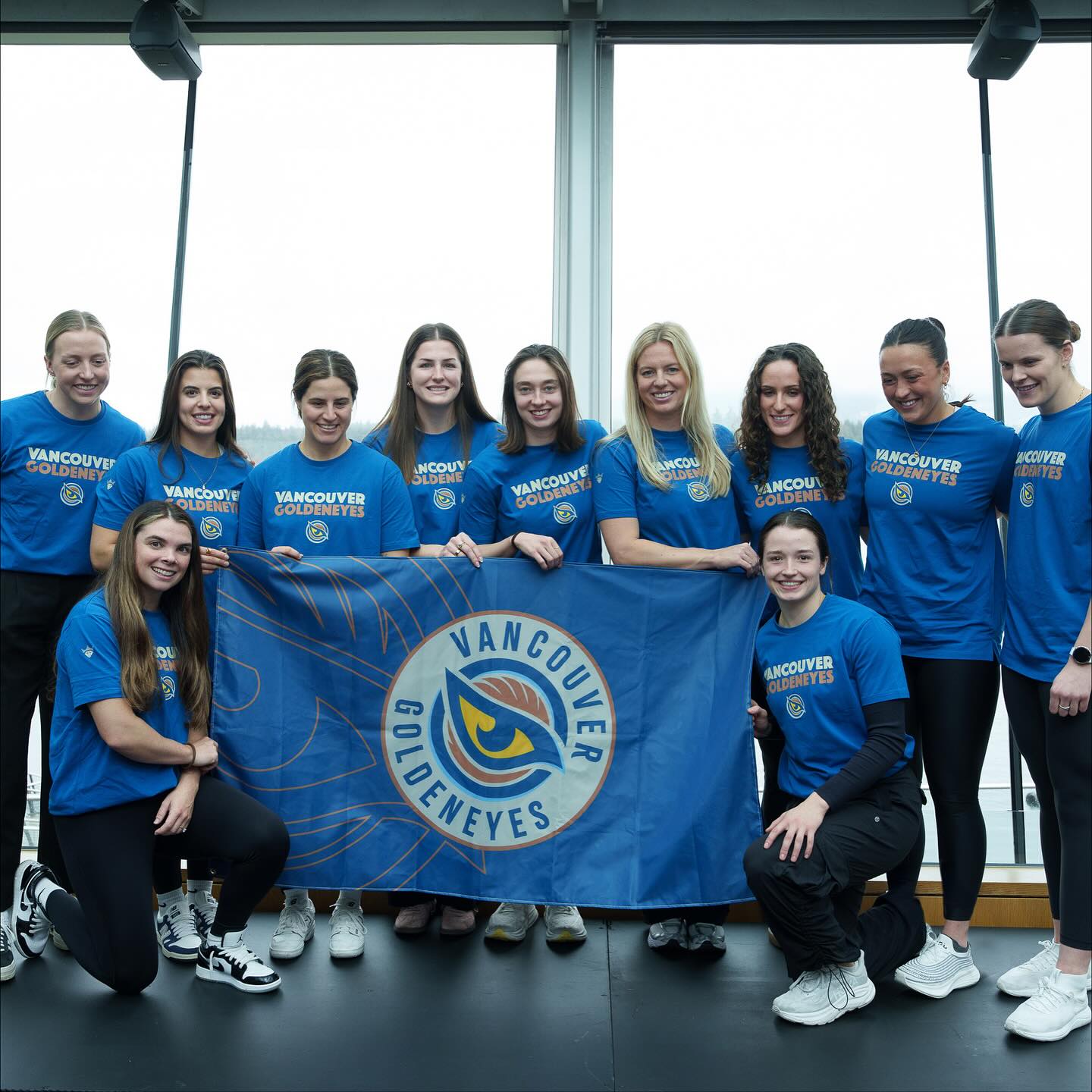
Sure – we still have skeptics who wonder why but they thankfully are in the minority while the majority are excited to welcome the new Vancouver Goldeneyes pro Women’s hockey team to Vancouver.
They start training camp next week at the PNE Coliseum for two workouts a day for the first week then finalize things both on and off the ice for their home opener, which I hope is packed with everyone welcoming them to Vancouver and area.
Over the past while I have been in conversation with the teams media and community relations Manager Liz Montroy who has promised to send up to date press releases to keep you “in the loop” asking for your support.
I for one along with my Sportswave team as well as Eastlink TV will be covering this event especially on the opening night considering that neither the Canucks or the Warriors are playing so mark the date on your calendar.
The following are the most recent press releases we received from Liz – Enjoy the read!!
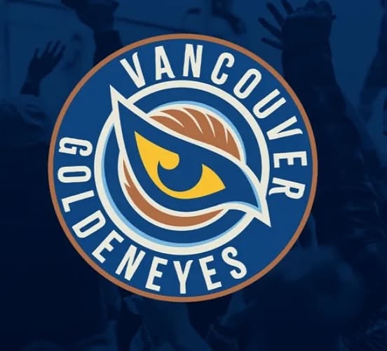
The Vancouver Goldeneyes’ logo is inspired by the Common Goldeneye duck species native to the Northern Hemisphere.
The logo features a golden bird’s eye with a bold, sunset gold color, symbolizing vision, clarity, and focus.
The eye is surrounded by wings in motion, representing speed, precision, and dynamic spirit.
The wings are curved, reflecting the natural meeting point of land and ocean in Vancouver’s unique geography. The logo points northwest, grounding the team’s identity in its geographical location.
The design embodies the team’s values of speed, strength, and unity, mirroring the bird’s characteristics.
According to General Manager Cara Gardner Morey, the Goldeneye’s ability to soar high, dive deep, and move in synchrony reflects the team’s aspirations.
The logo’s color palette includes Pacific Blue, Coastal Cream, and bronze, paying homage to Vancouver’s natural beauty.
Logo Design Elements:
- Golden Eye: Symbolizes vision, clarity, and focus
- Wings: Represent speed, precision, and dynamic spirit
- Pacific Blue and Coastal Cream: Reflect Vancouver’s coastal landscape
- Bronze: Adds an earthy tone, echoing the city’s natural surroundings
Overall, the logo is a meaningful representation of Vancouver’s spirit and the team’s identity.
What’s the inspiration behind the name?

The Vancouver Goldeneyes got their name from the Common Goldeneye, a bird native to British Columbia’s coastal waters and forested lakes.
This bird is known for its striking appearance, with piercing yellow eyes and lightning-fast reflexes, making it a fitting symbol for a hockey team.
The name represents precision, agility, and resilience, qualities that mirror the game of hockey and the athletes who play it.
According to Ali Bologna, PWHL’s Senior Director of Brand & Marketing, the team wanted a name that felt truly unique to Vancouver, reflecting the city’s natural surroundings and authentic outdoor experiences.
The Goldeneyes logo features a bold golden eye at its center, symbolizing vision, clarity, and focus, with elements that reflect the city’s geography and the bird’s swift movement.
Some notable aspects of the team’s name and logo include²:
Team Identity: The Goldeneyes aim to embody the qualities of the bird, such as speed, agility, and resilience.

Advertise With Sportswave

Canadian Choice Awards

About Sportswave

2026 CANADA CUP